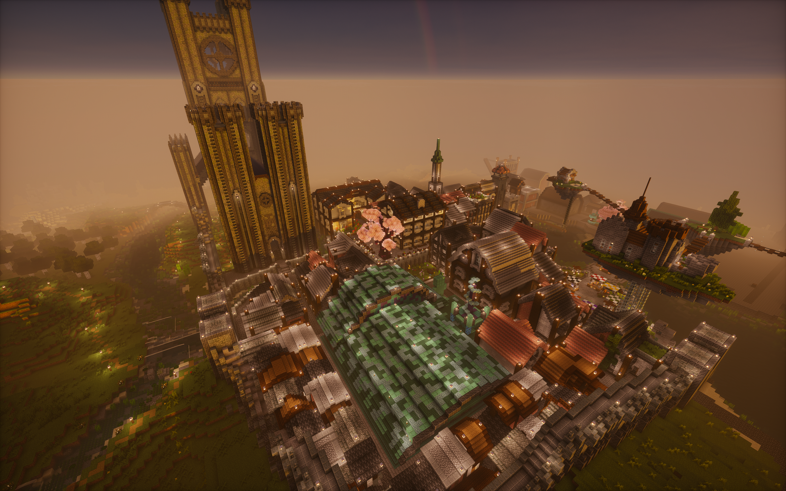
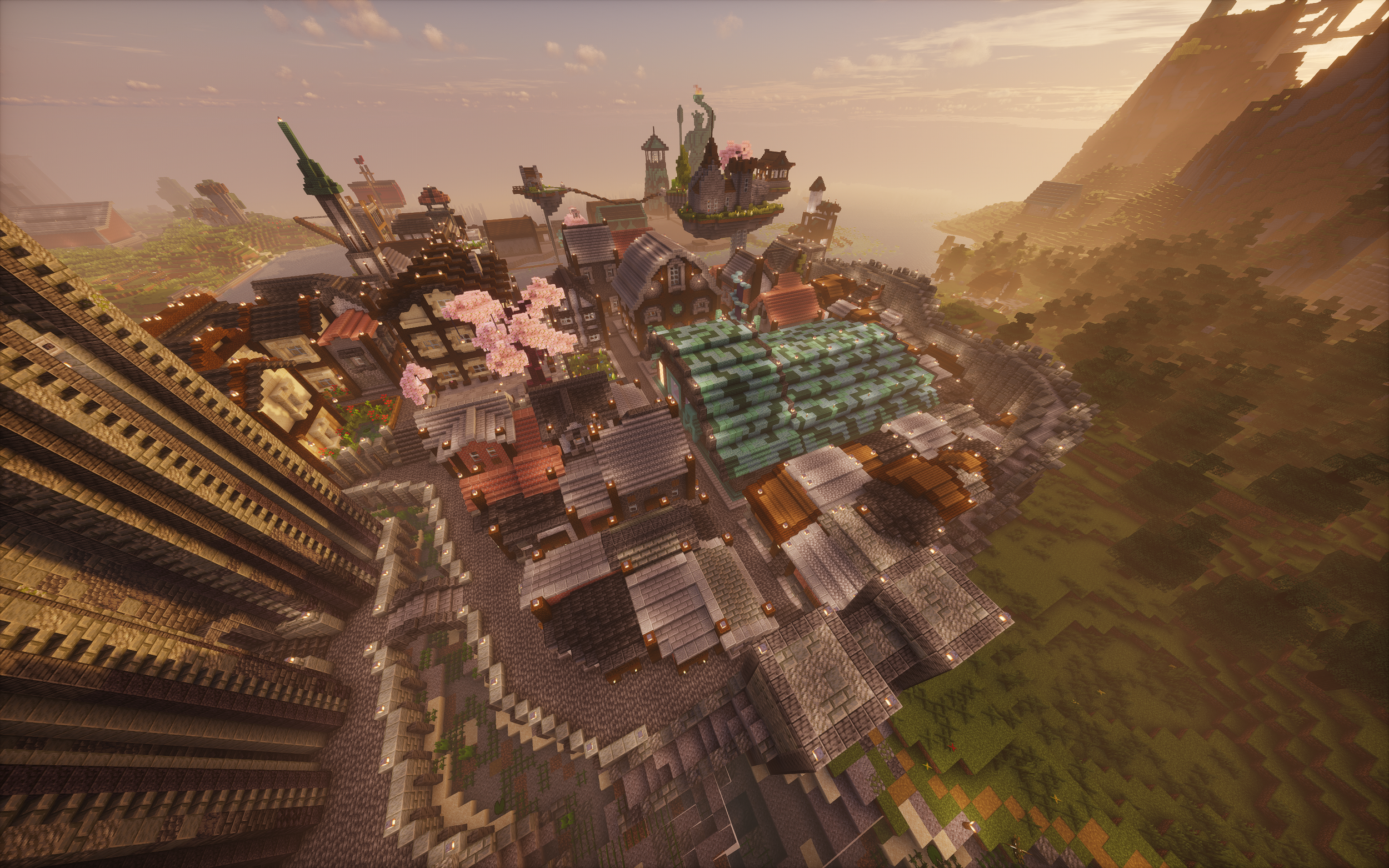
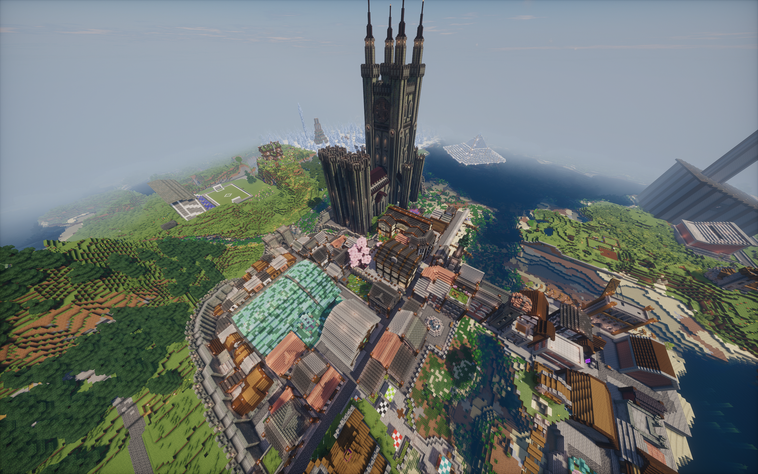
The Town
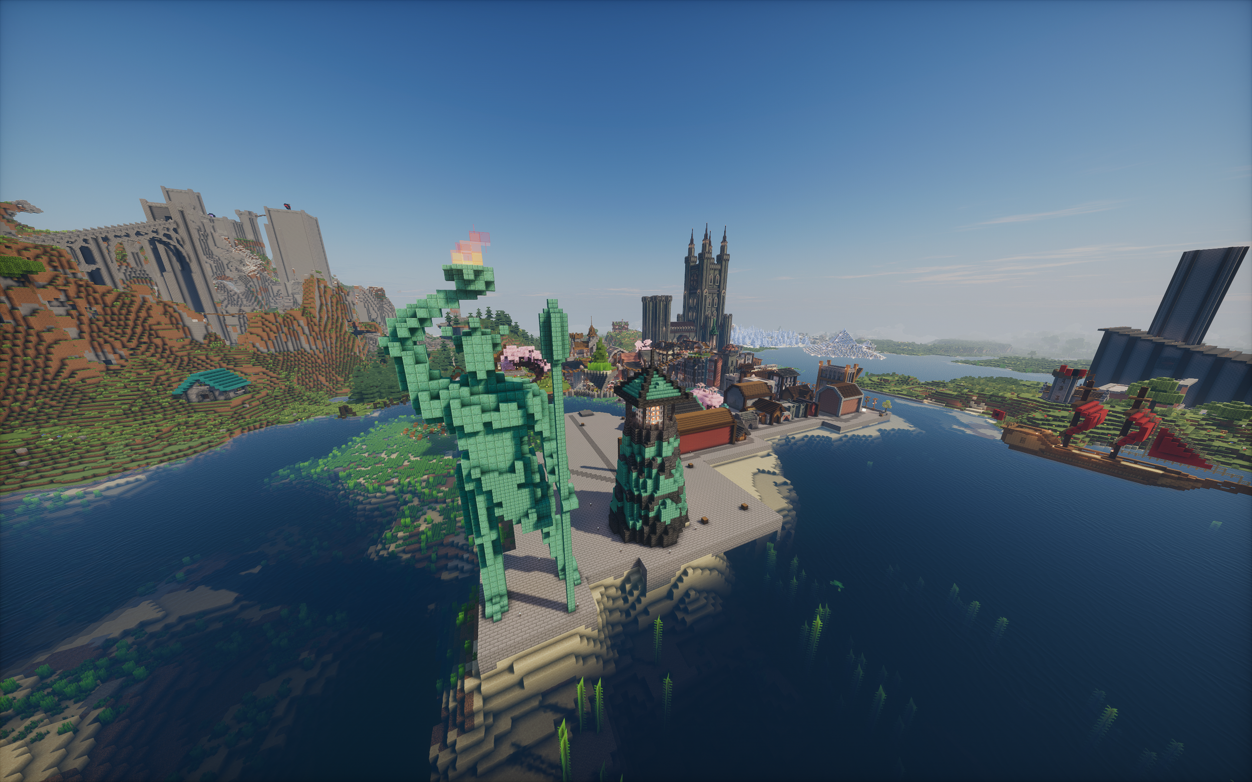
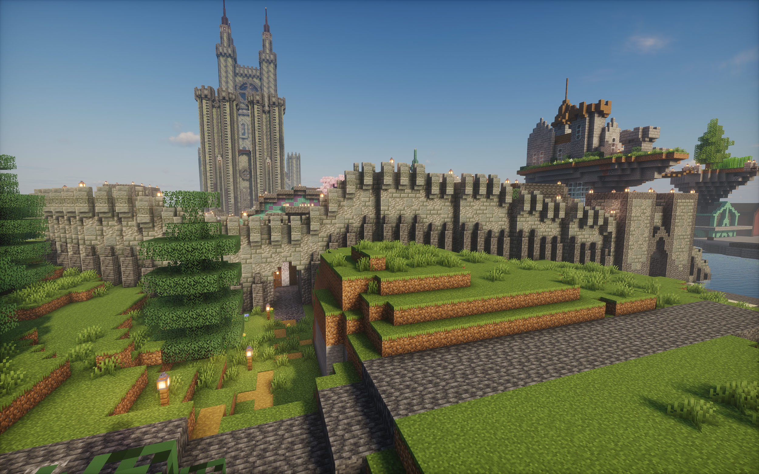
The Town was my on and off project for over a year. I can’t make a good estimate at the number of hours spent working on this town but I do know it its over a hundred. It was a very unique project in terms of the approach I took as well as the set of parameters and challenges that I faced. The most obvious of these was that this build site was not exclusively mine. Most of my builds are done on a private multiplayer server where I play with my friends and this project was designed to build a town that would contain all of our houses and previous builds in the area. Some obvious examples of this are the floating island network above the town and the large turquoise roofed house in the foreground of the photo above. These where both built by my friends and existed before I built that section of the town around them. Approximately 80% of the builds in the town are done by me though I enjoyed giving projects within it (such as the Saloon) away to my friends and then incorporating their builds into the surrounding streets. I will make sure to point out when any build I reference was not done by me.
Design
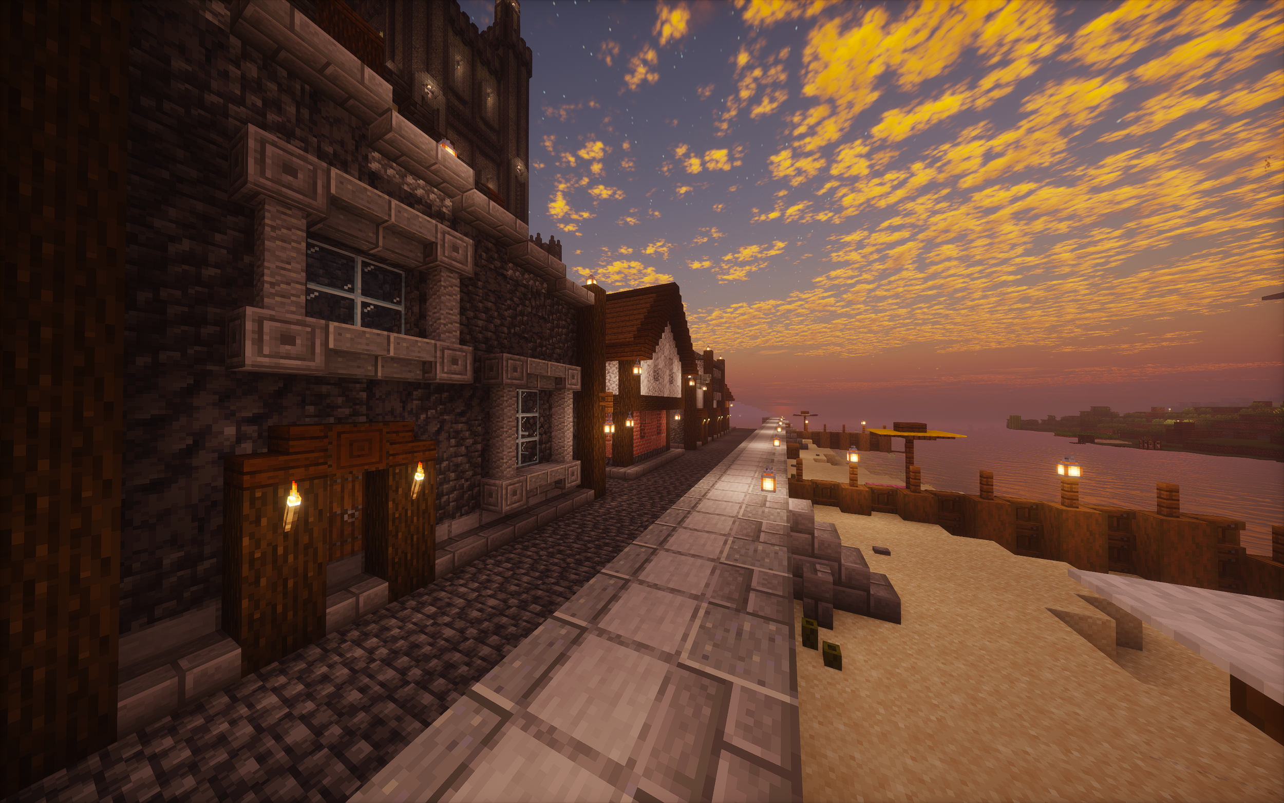
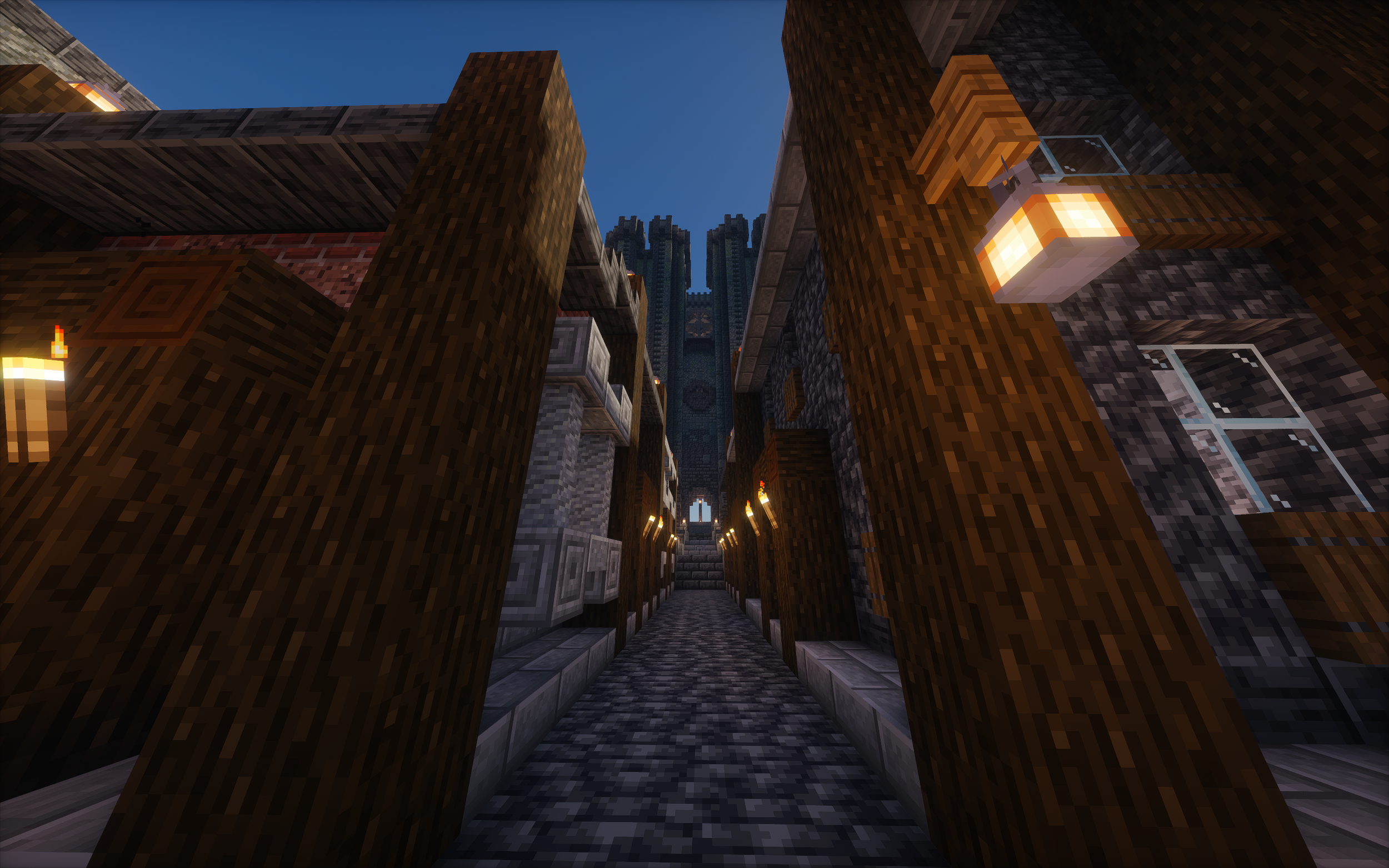
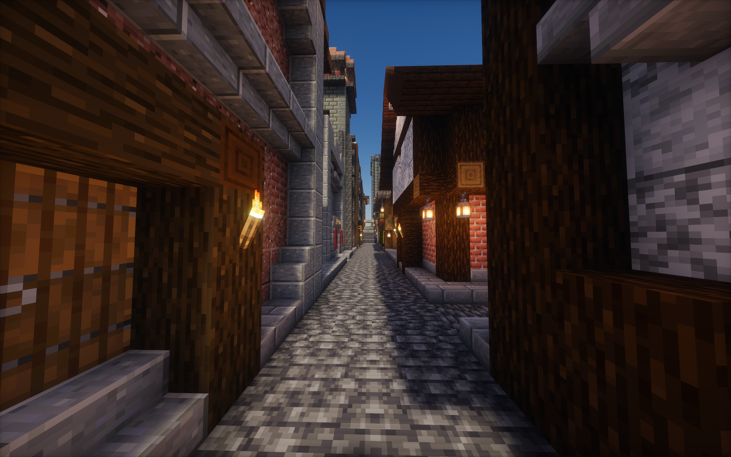
With the town I decided the best approach would be to just start building houses and let the vision and style develop naturally. I knew I wanted a roughly Victorian era town and I simply trusted this to guide me. Looking back I regret this and wish I had at least planned out the streets before I started building as my greatest problem with the Town is how straight all of the roads are and how most junctions simply meet at ninety degree angles. This simple flaw is what I found breaking the illusion of a true Victorian town the most. By the end of the project I started implementing a few curved or angled streets though at this point it was too late.
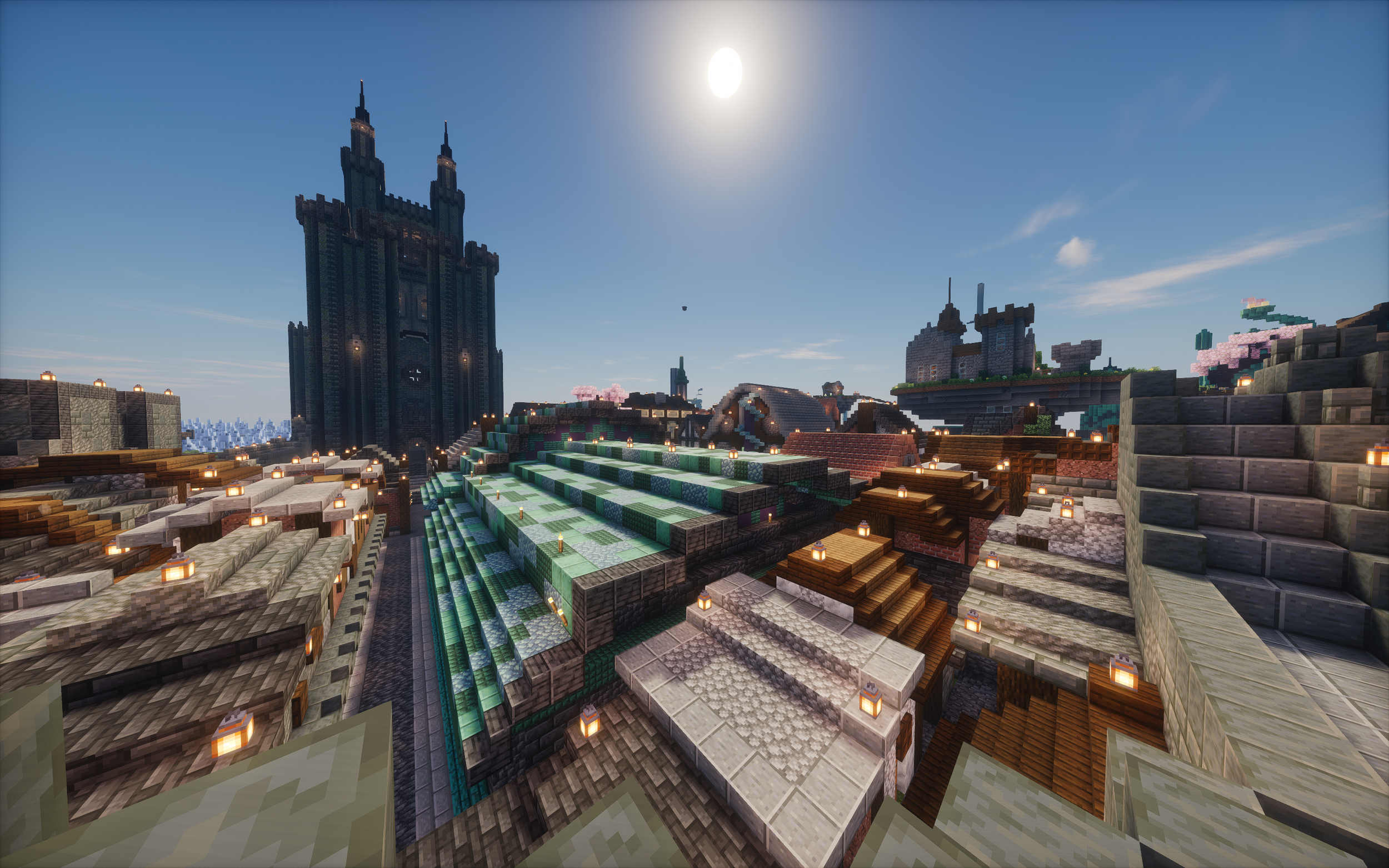
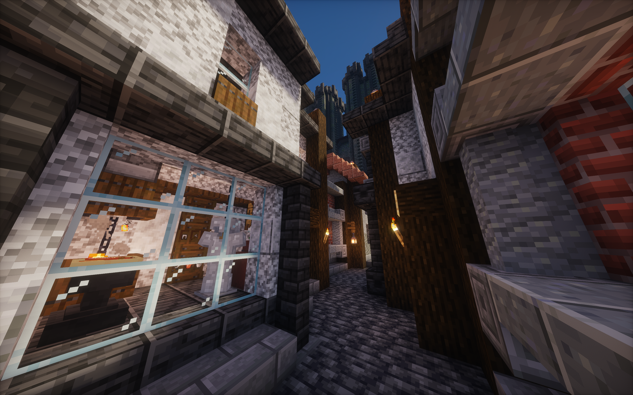
Once I realised how long I’d spent working on the first few houses I thought for a long time before picking a distinct design philosophy for the project. I had attempted settlement style builds before and I knew that there downfall was always that they ended up being too small and not really conveying that urban feeling when the end of the street always just led into a forest so I knew that at an urban builds core was a minimum size to make it feel real. However to achieve that size in a reasonable time (time being a constraint due to burnout) I knew I’d have to adopt a quantity over quality approach and as I went on I thankfully found that in this case quantity had a quality all of its own. At this projects core is the fact that individually most of the builds produced in mass by me aren’t anything special (in fact nearly all of them lack any interior and those that have them were done by one of my friends for me) but because of how the buildings connect, your focus isn’t drawn to this, it gets lost in this feeling of wondering through endless streets and catching glimpses of rooftops, skylines, towers and the cathedral through breaks in the houses.
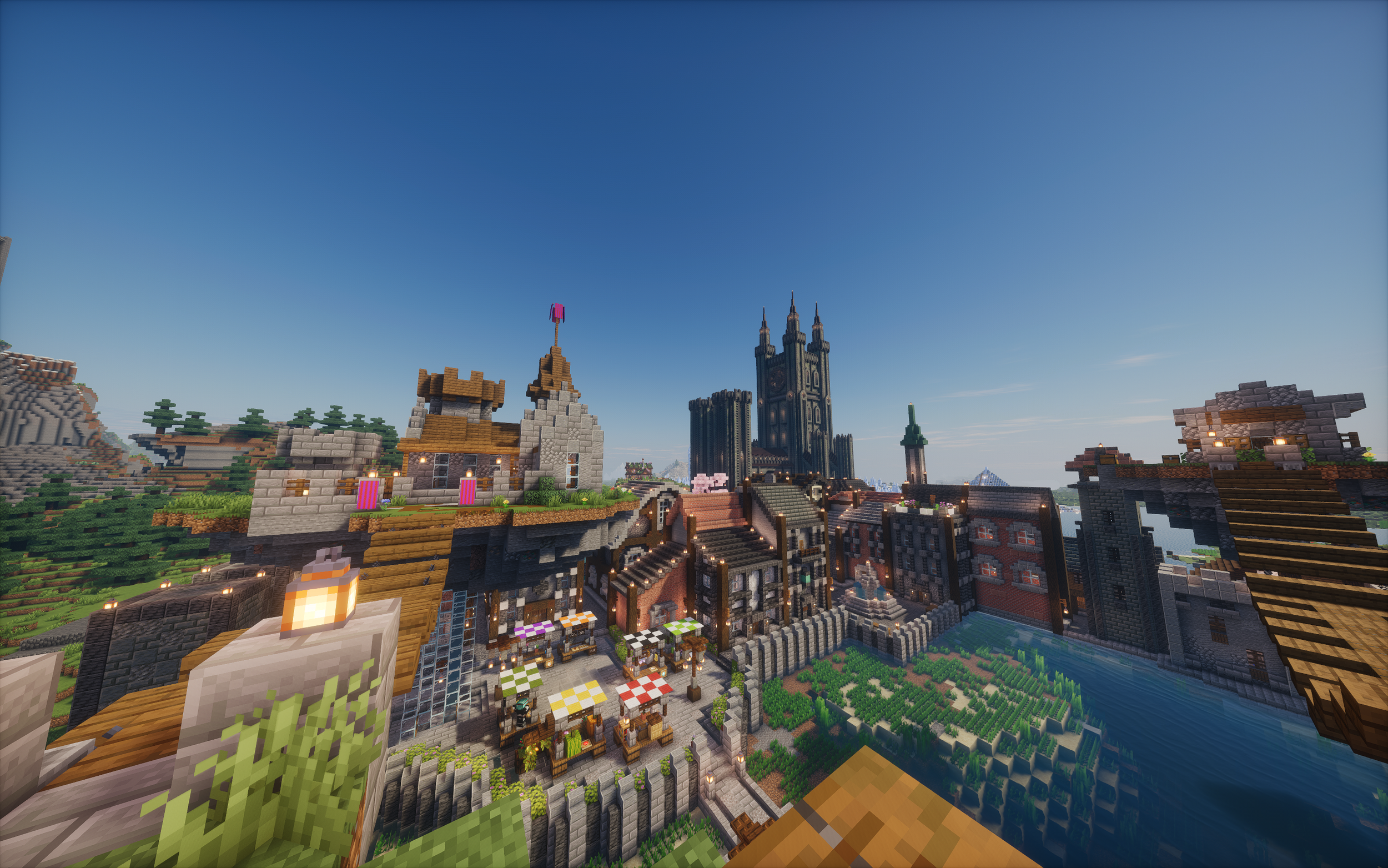
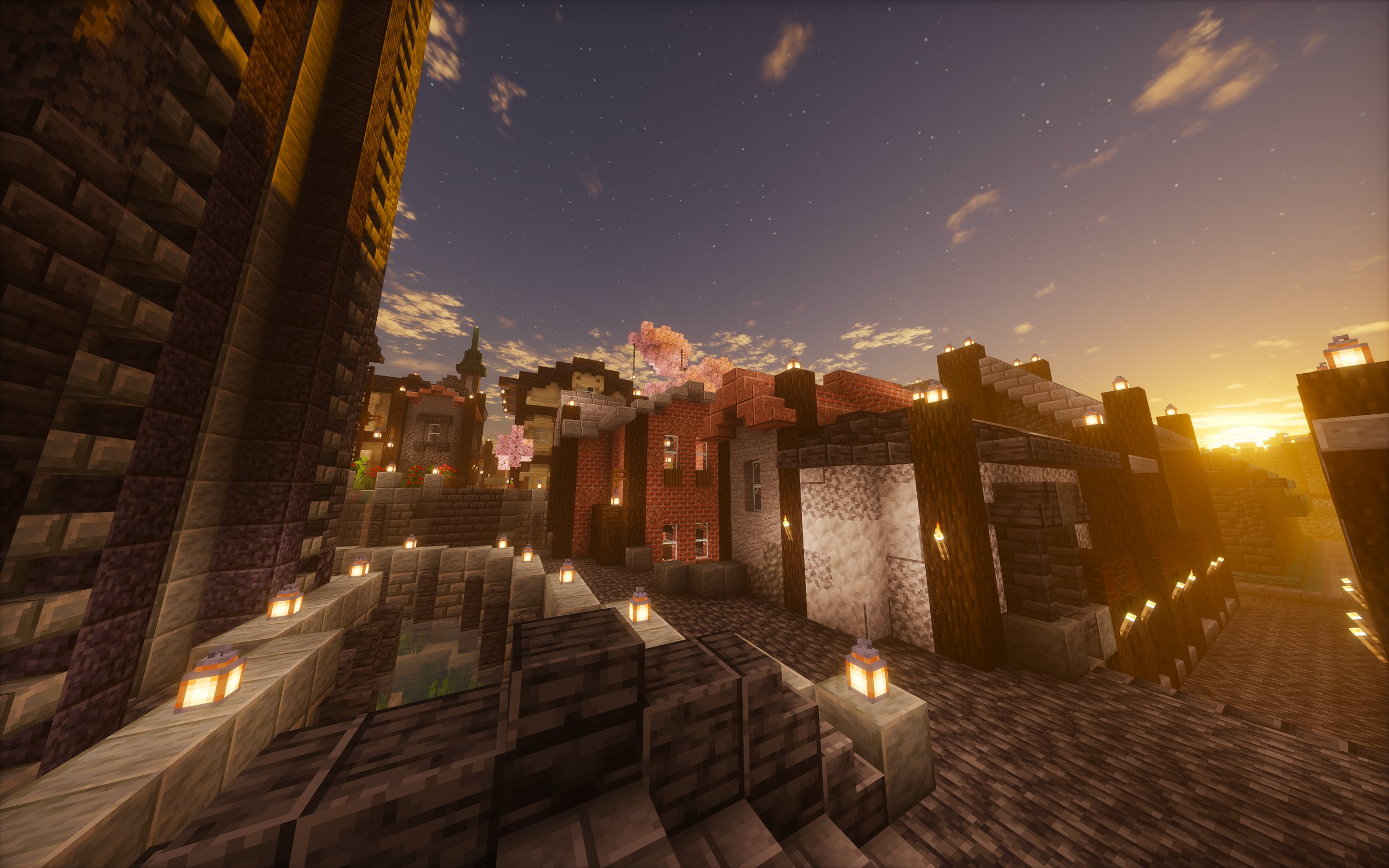
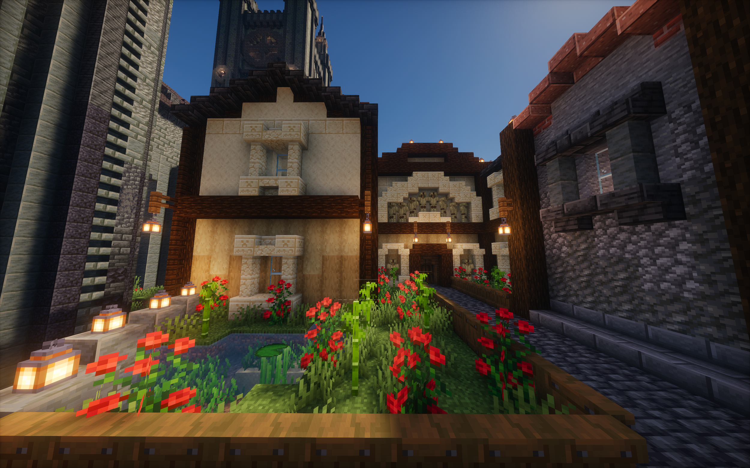
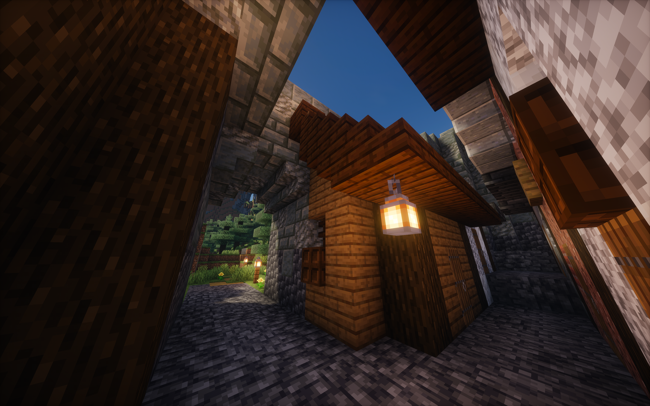
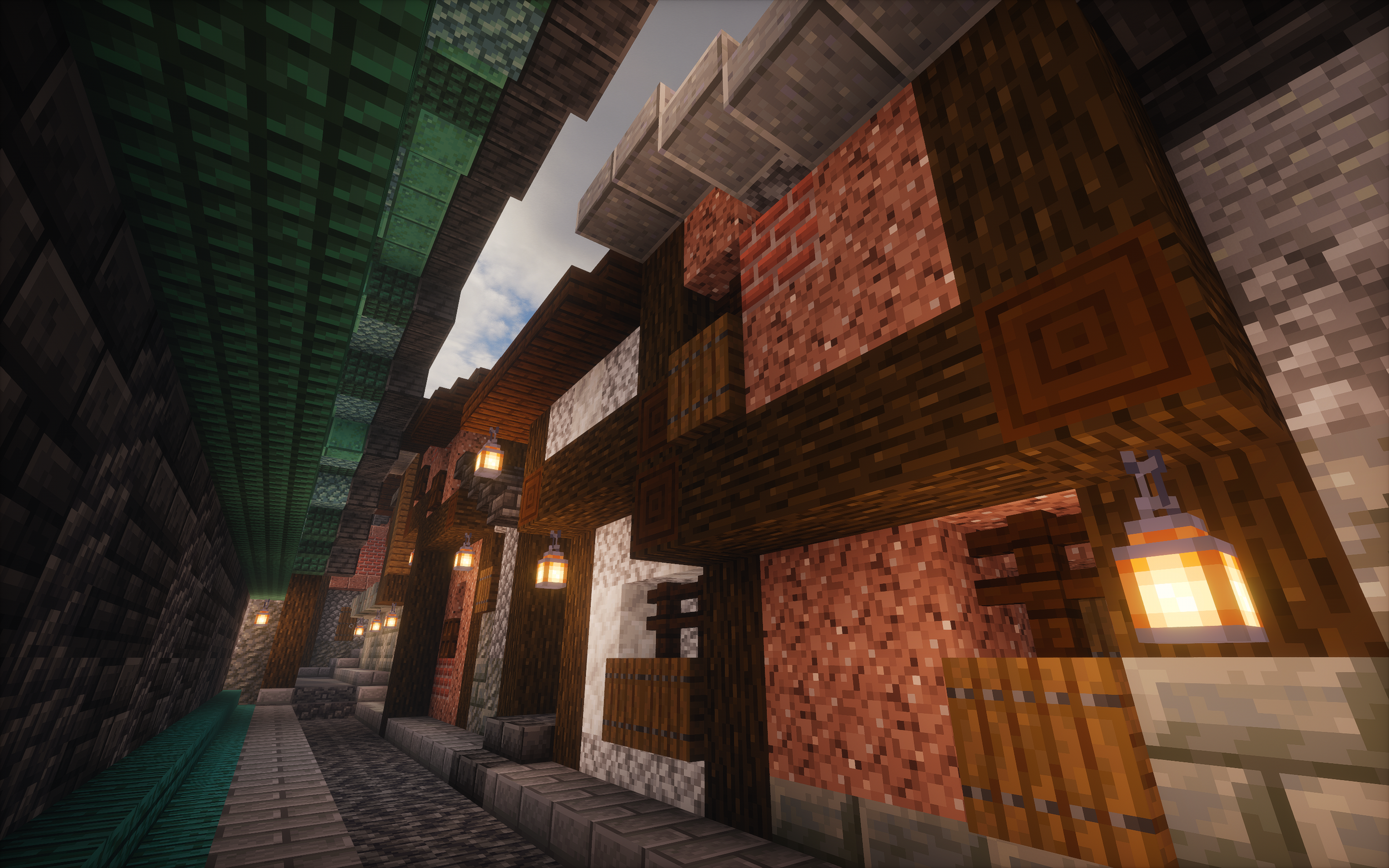
To both speed up progress and also to tie buildings together in the same architectural styles I set certain rules for the run of the mill houses. For instance in the picture above you can see the similar window frames used on two buildings although this design was most often repeated in different block types on separate houses. Alongside this all door frames and support beams were build from the same wood type, ‘dark oak’, in my mind this was to convey that most wood used to build this town would come from the nearest forest, which would consist mostly of the same type of tree. On top of these I used four common block pallets that I repeated throughout the town. These were red brick, dark stone, grey stone and white. Having these set not only sped up the building process by making it so I did not have to design each house individually but simply had to pick from a set of prebuilt assets for the colour, window frames and roof colour but also massively sped up the resource collection by allowing me to gather all my materials in one place without having to go searching for a new set of blocks for every house.
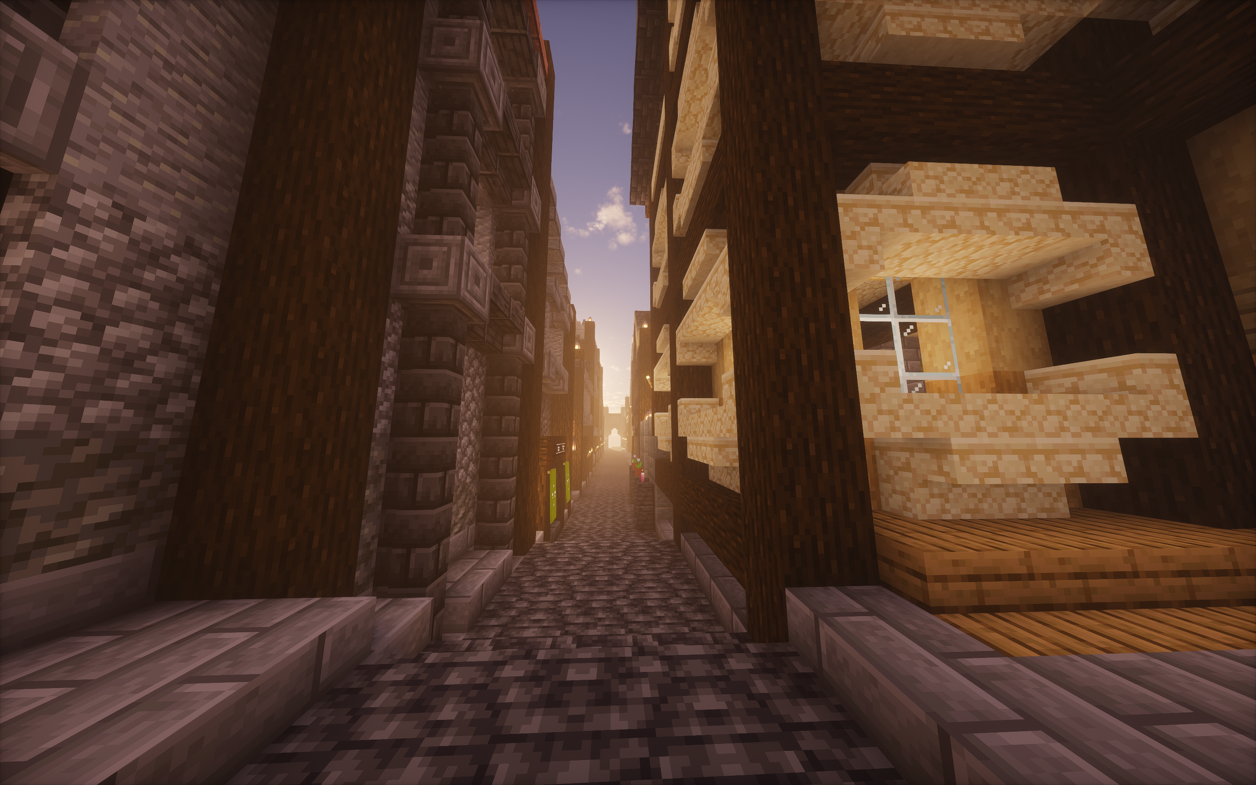
The Slums
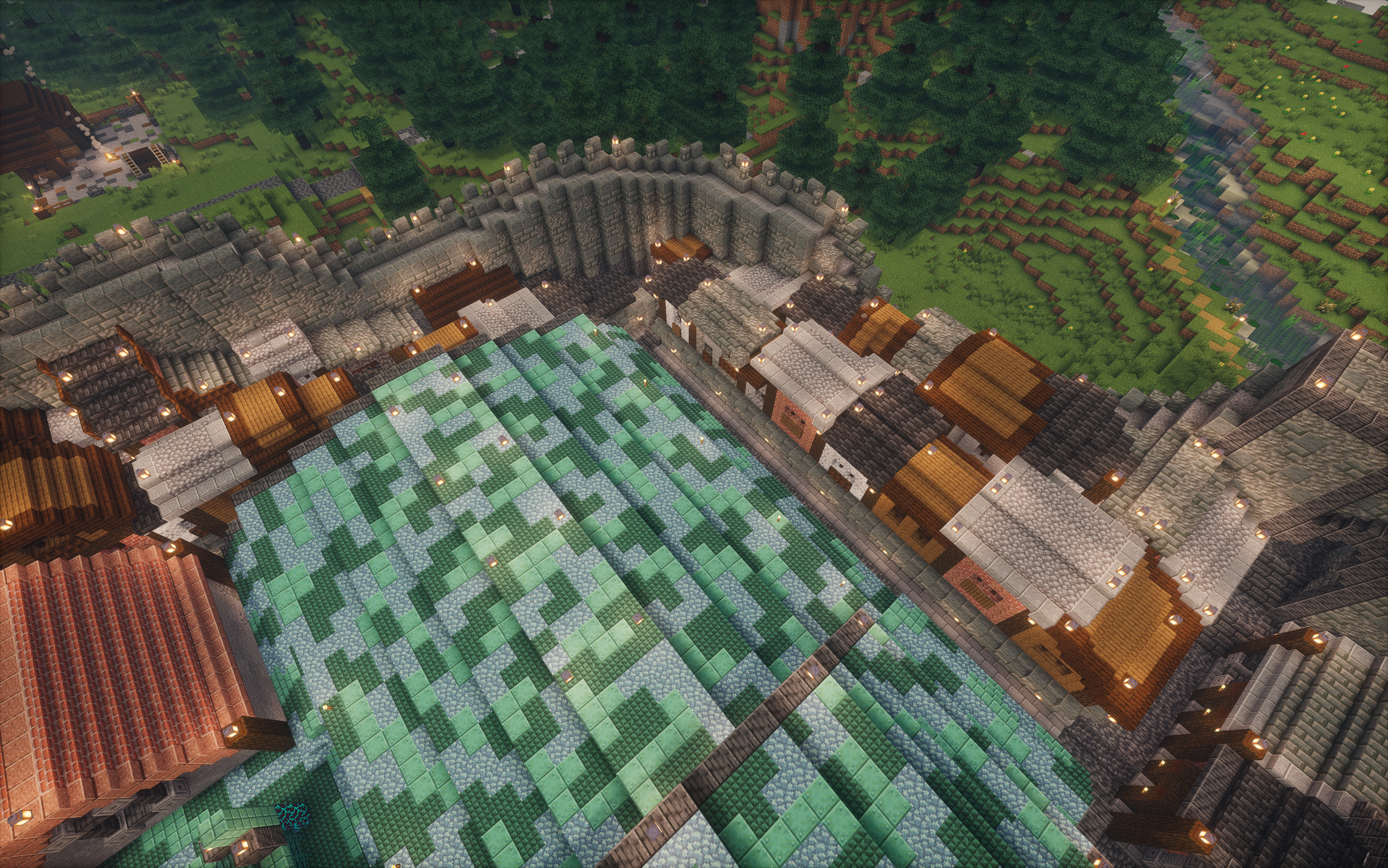
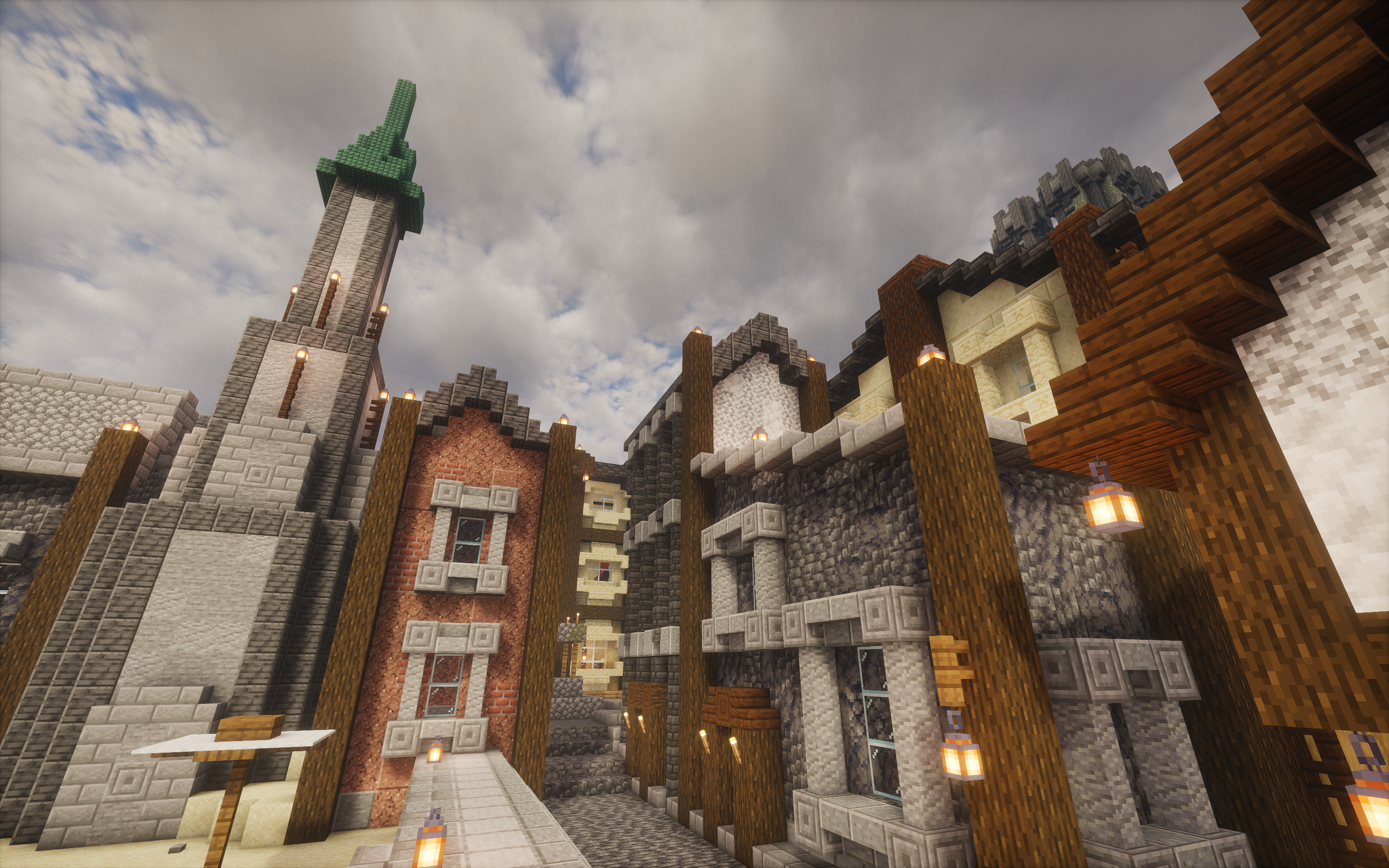
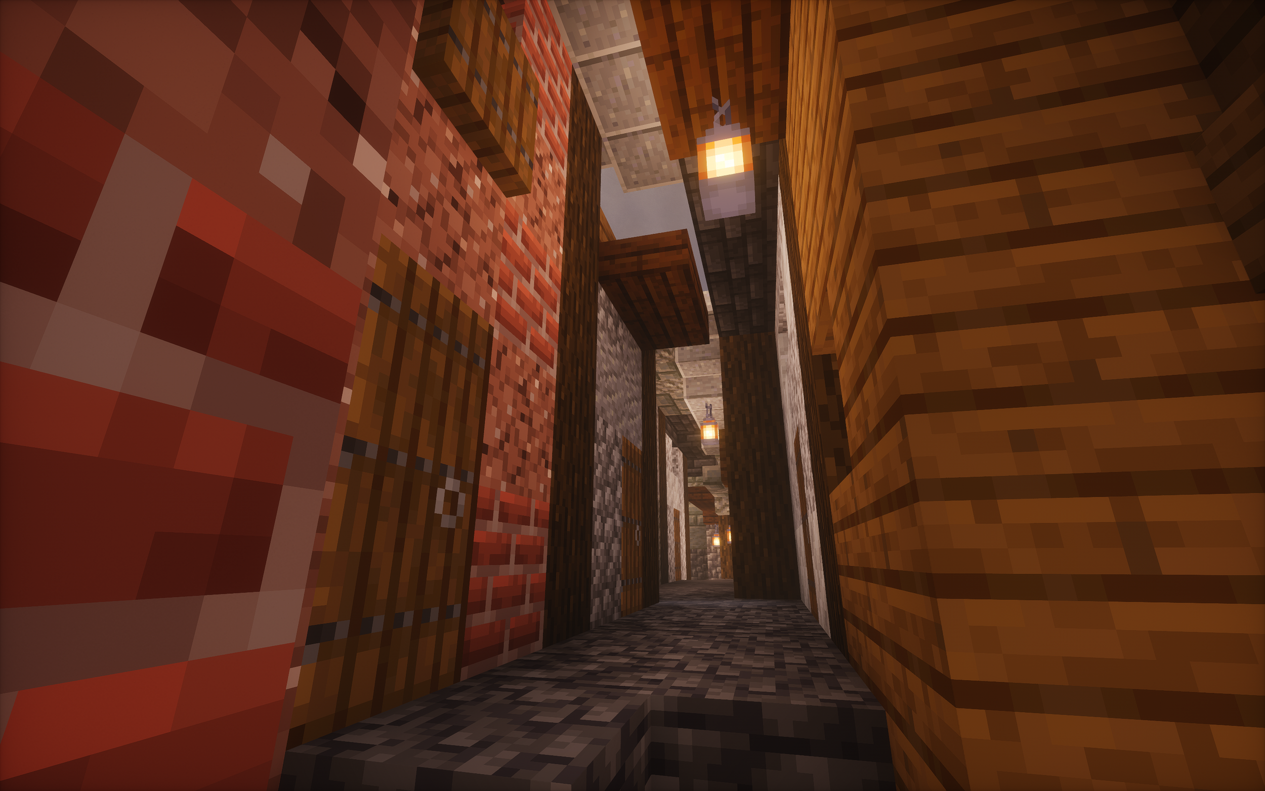
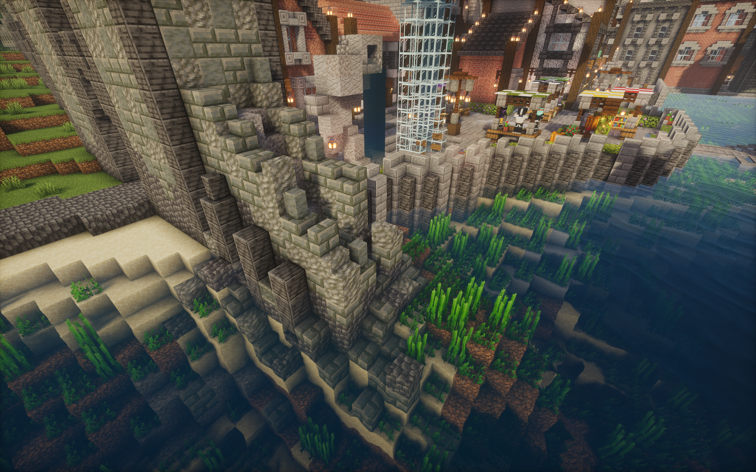
The Slums are the only real district of the town and were one of the last sections I worked on and were my answer to two problems I had at the time. The first was what to do with the very awkwardly sized curve of empty land between my friends large turquoise build and the walls as it was too small to have a proper row of houses, especially at the back. The second was that at this point in the project I still wasn’t happy it was producing the feeling of tight winding streets with a thin slice of sky just peeking through the roofs. By building much smaller houses I could fit two rows of houses in between the wall and the large building and then this gave me the opportunity to create that feeling I was looking for by making the street a few blocks narrower as well. Building on this tiny scale in Minecraft is a real challenge and one that I struggled with immensely. With only a two block wide road, having a design that required a full block sticking out from a house would block the whole street if mirrored on the house opposite. Because of this and the desire to convey the lower quality of these houses, I had to rework the formula I had been working of. I introduced a new wooden house type using a rich brown colour, made wooden roofs more common, removed doorframes around the doors and even roughed up the quality of the street itself with less consistent texture to suggest missing cobbles.
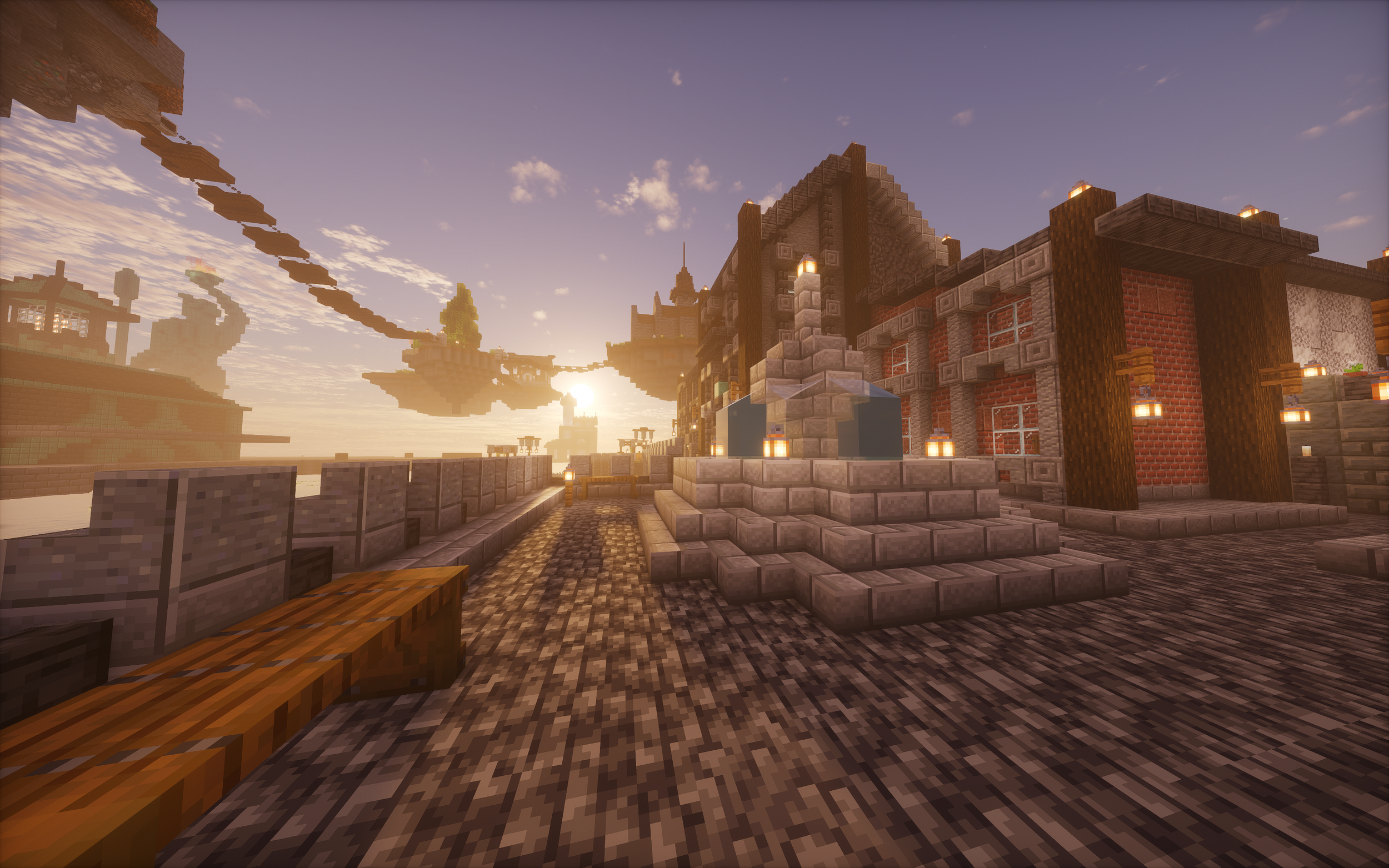
The Walls
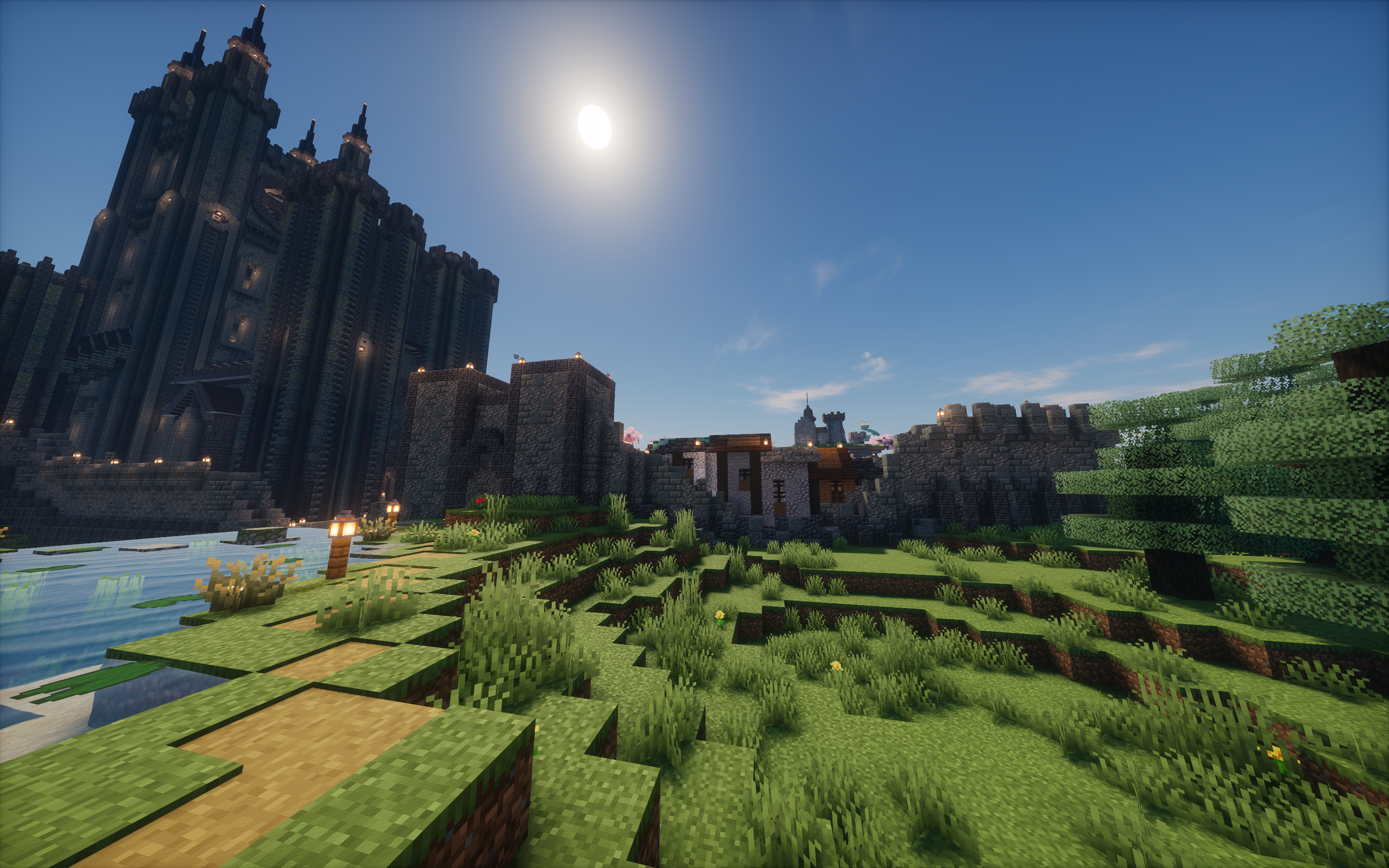
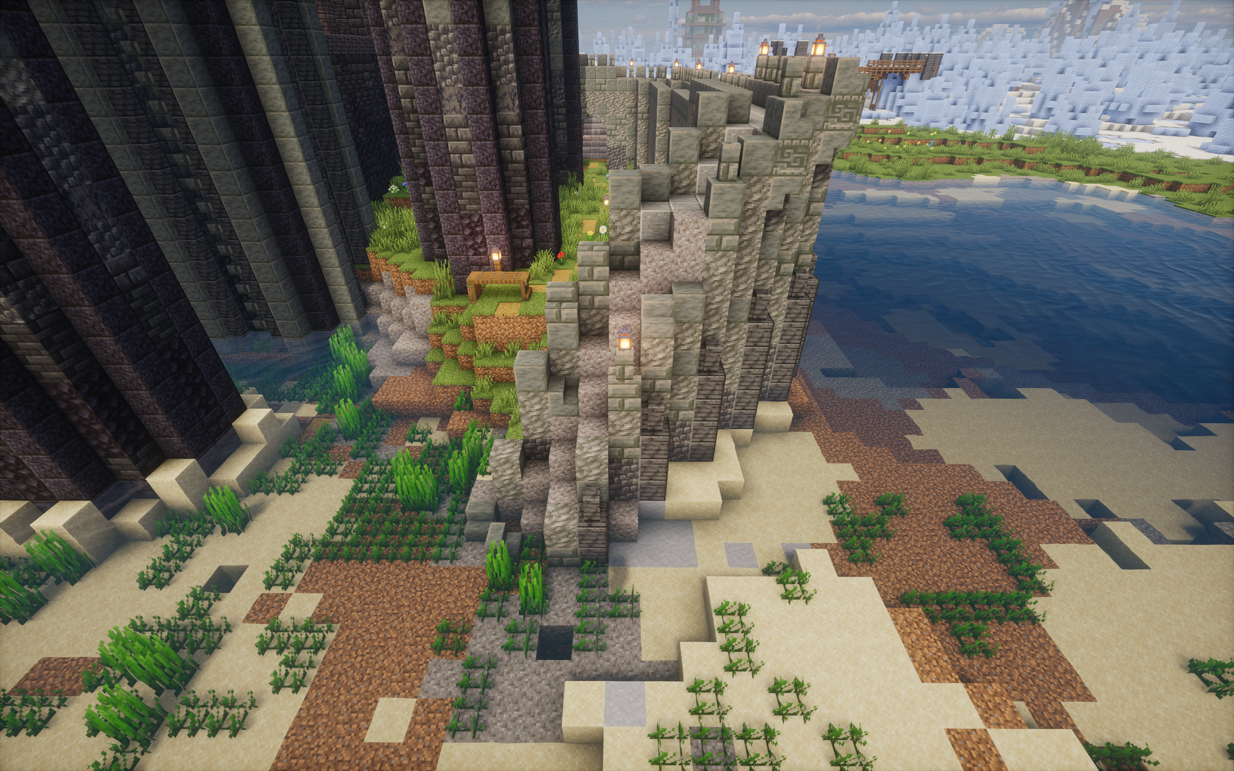
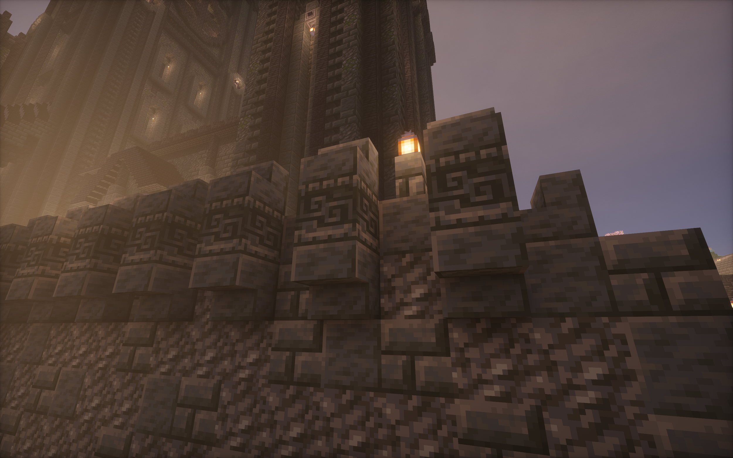
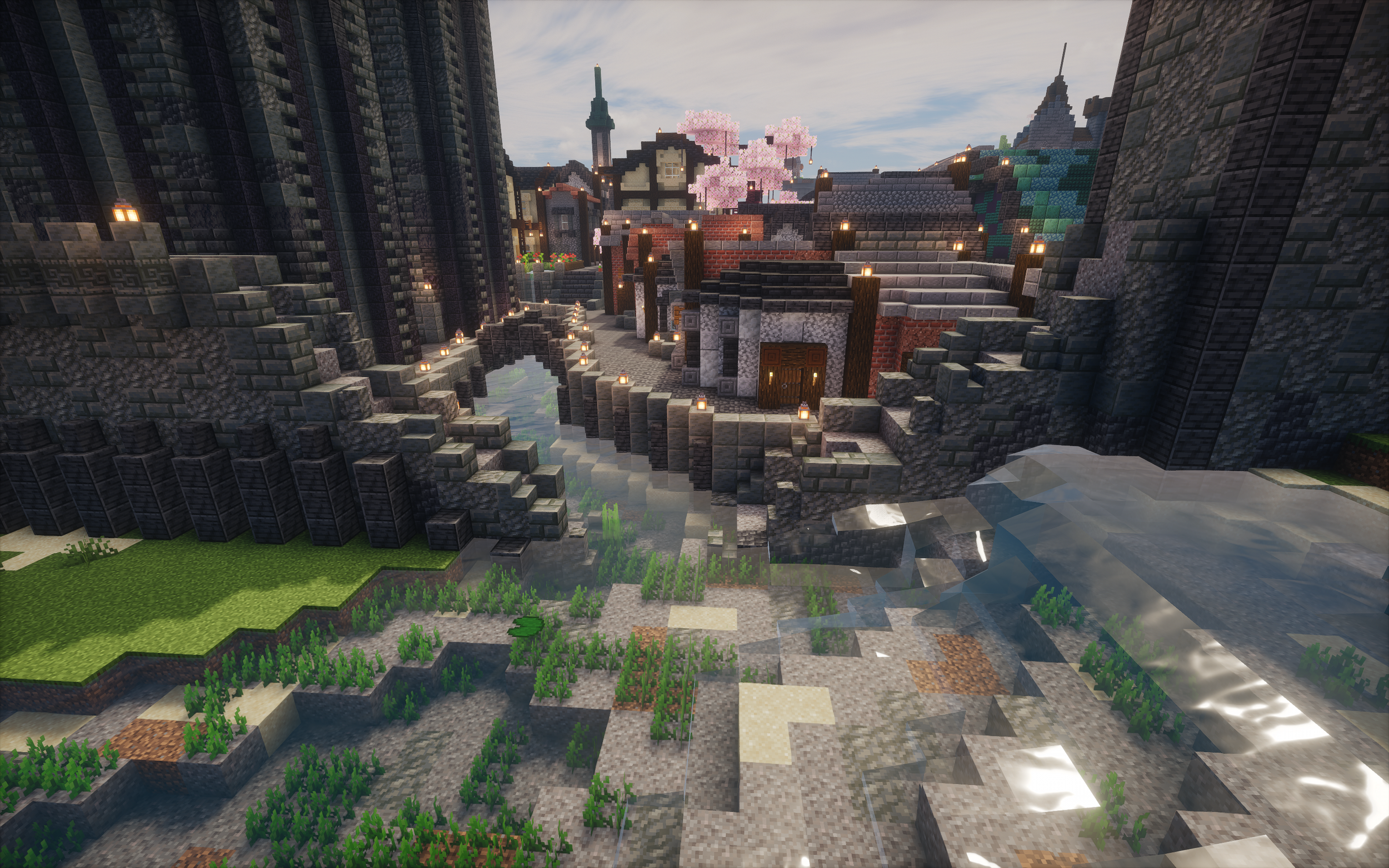
The obvious design choice I took with the walls is that this is the only build that uses the same ‘tuff’ block pallet as the cathedral. This was to link these two builds together as the oldest parts of the town. In my mind the story is either that they are simply built out of a material that isn’t used anymore or that this is the same stone that is used elsewhere, just a different colour because of its age and exposure to the elements. I think I prefer the second story more.
Another aspect of the wall was deciding the placement of the ruined sections. The first of these you’ve seen already, in the Slums, but there are four others shown below.

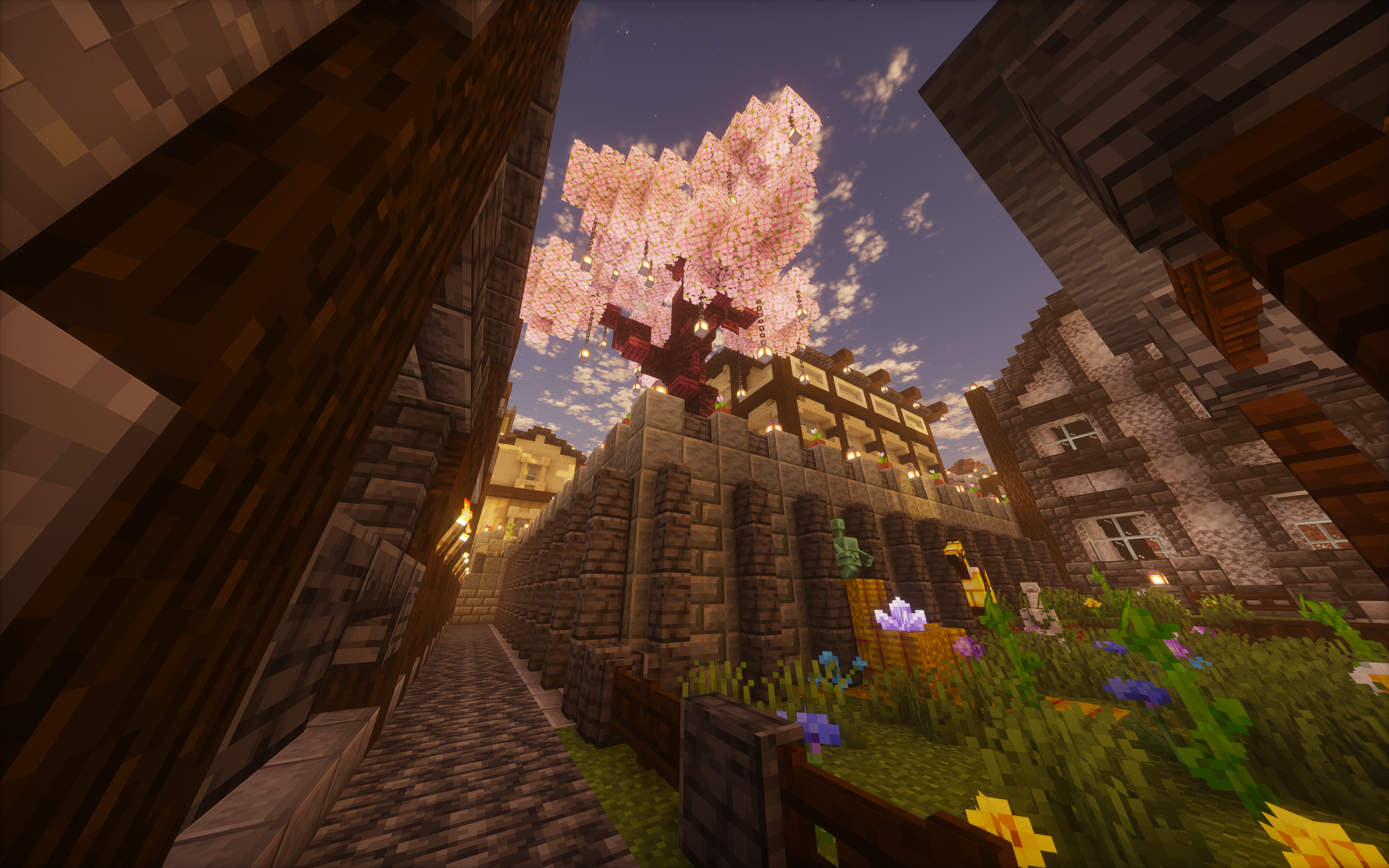
The Slums were also positioned here for two more reasons. Firstly, these smaller, lower quality houses would be logically found on the edge of town (if this project were larger I would have placed them outside the wall entirely) in a more affordable area as it’s a Victorian town and suburbs hadn’t started emerging yet. Secondly having solid ancient walls for these makeshift houses to lean up against really adds to the feeling that these houses are barely staying upright and are thankful for having one stable wall already built. In some places, these houses use ruined sections of older structures as foundations which perfectly encapsulates the sort of environmental story telling I hoped to achieve within the town.
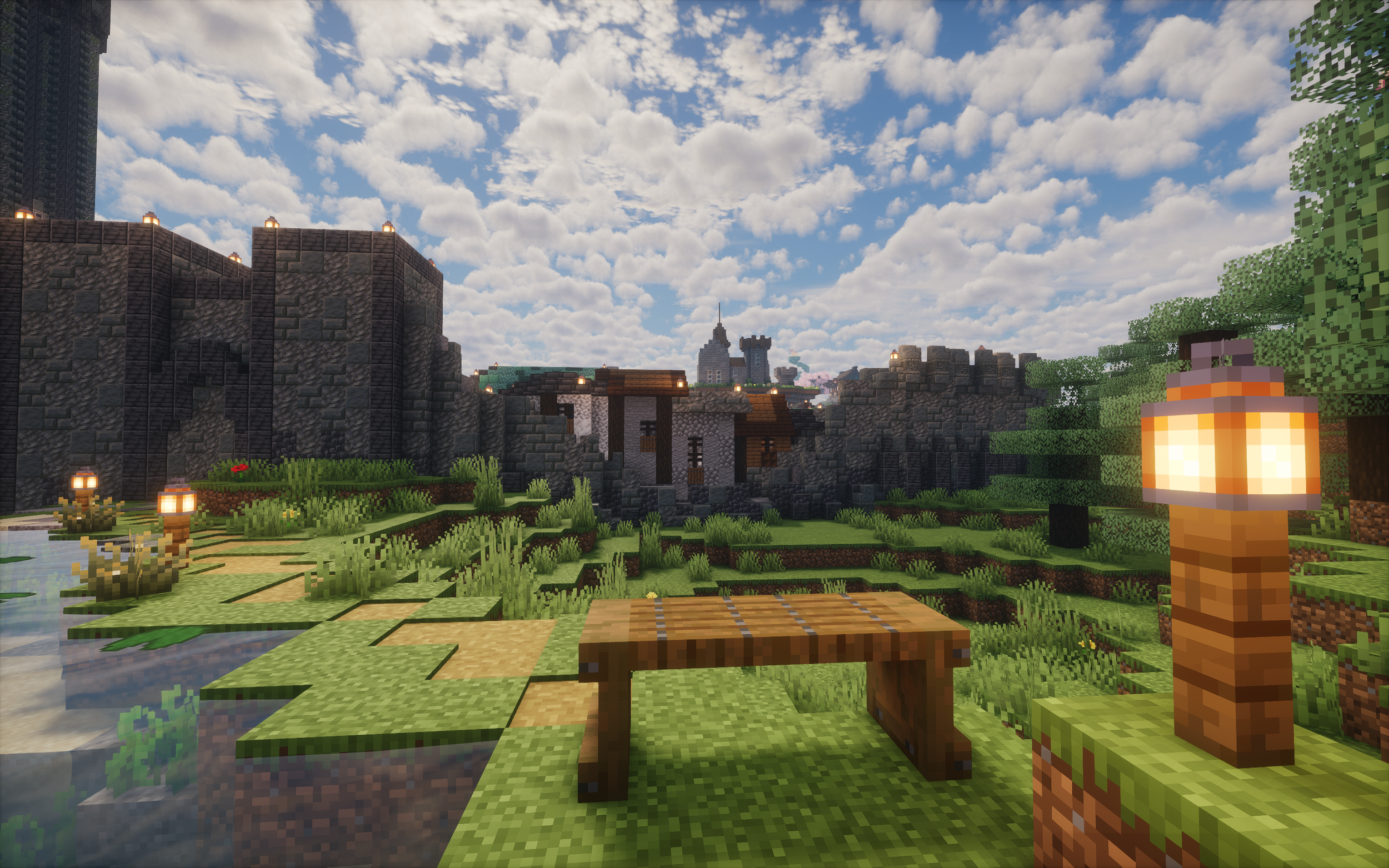
I think this view perfectly encapsulates that message. Showing the Slums peeking through a section of ruined walls, really showing the meeting of old and new theme better than anywhere else (to the point I built a bench here).
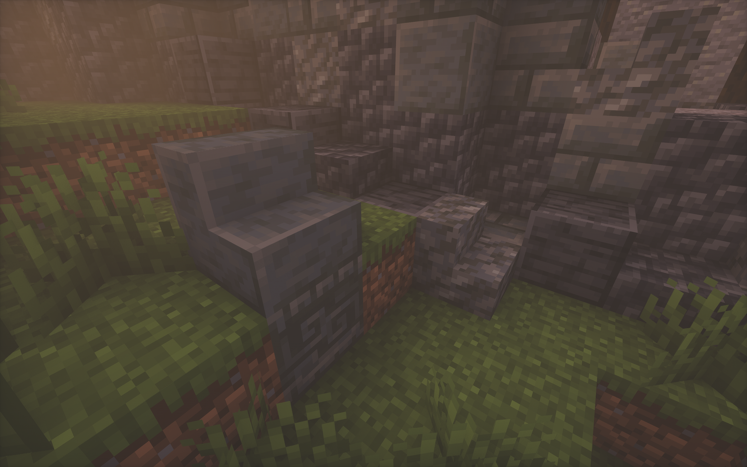
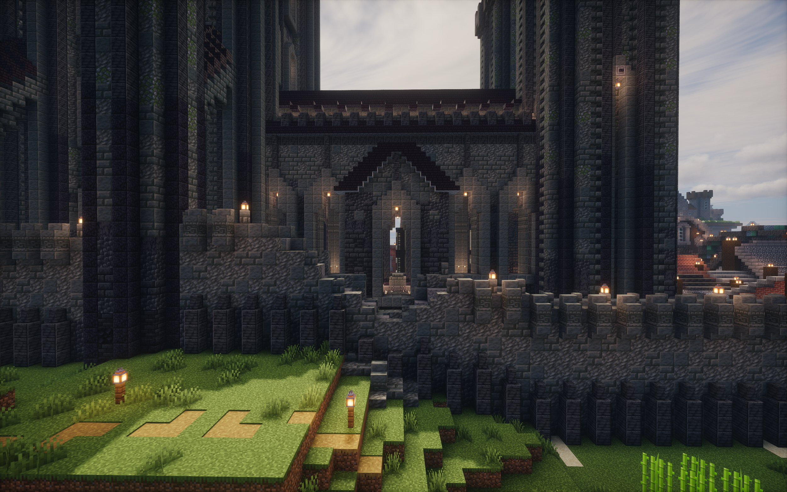
The walls were one of my favourite sections of this project and in particular the ruined sections of the wall. Though these sections may simply appear to be a random scattering of blocks, I put a lot of thought into the placement of little details to tell the story of how the wall fell. My favourite small example of this is shown below where I recreated one of the merlons at the base of the wall, embedded in the ground from its fall and the subsequent time that had passed.
The first three of these are simply where the wall meets the sea at two ends and then where the river flows into town respectively. These were made to suggest changing coastlines which is one of my favourite ways of showing age in a build. By placing the build somewhere that wouldn’t make sense for it to be built if it were being made today it shows how the world has changed around it since it was constructed. I get such a feeling for the changing times and what the world might have been like when it was built that is hard to emulate from just making a build look old. In this instance where a build is placed is just as powerful as the build techniques themselves.
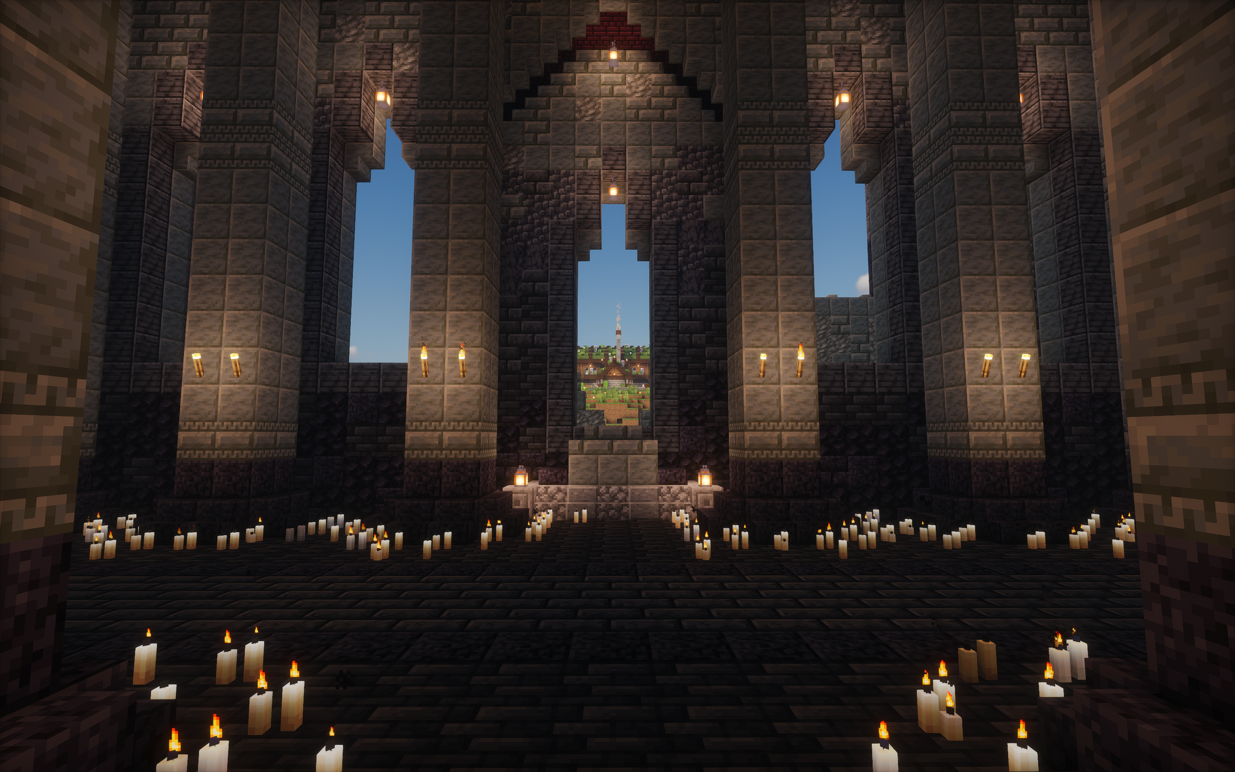
The final picture above shows a dent taken out of the wall along the wall stretch that runs by the cathedral. This is the longest stretch of wall and looked too pristine without it but as for why I placed the section there specifically and decided to knock exactly that much height off of the wall was simply to preserve a very pretty, unintentional sightline from within the cathedral looking at a little cottage on the hill that my some of my friends built that just so opened to be perfectly aligned with the central window.